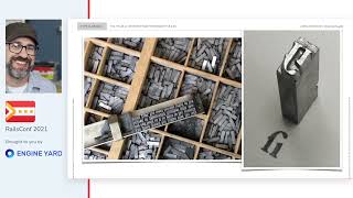
FUTURE TYPE: Using the History of Typography to Inform the Future of UI

summary
Argues that a 2,000‑plus‑year typographic lineage and accidents like Bell Labs adding the star and pound in 1968 lead to today’s hashtag adoption in 2007 and can guide UI design. Proposes two concrete paths: natural user interfaces — gestures, sans‑text graphics, haptics, Daydream‑style soft headsets and Amazon Dash buttons that successfully auto‑order — and zero UI — conversational, screenless systems requiring clear feedback, situational vocabularies, body‑as‑button prototypes and consistent multimodal language.
AI-written summary · about
chapters (13)
- 0:00Introduction
- 3:25The History of Typography
- 6:10The Roman Alphabet
- 12:20Why was that important
- 13:54What about the future
- 15:34Quote
- 17:02Gathering Information
- 21:02Communication Needs
- 22:28User Kit
- 24:09Natural User Interface
- 25:53Graphic Interactions
- 32:34Organic Touch
- 35:03Invisible UI
related talks
 01h 08mBack to the Future! A History of UIs through Trends and Mass Culture
 28mThe Future of Design is Still Personal: Reaching Toward True Adaptation
 22mThe Future of Design is Still Personal: Reaching Toward True Adaptation
 14mDesigning UIs without a UI designer
 01h 18mType Is Design:Fix Your UI with Better Typography and CSS
 01h 03mFonts, Form and Function: A Primer on Digital Typography
 29mThe Future of Design is Still Personal: Reaching Toward True Adaptation
 31mBuilding the next computing platform