Death to Icon Fonts
summary
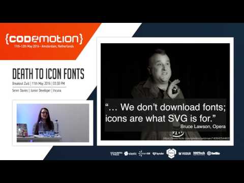
One in ten people have dyslexia and changing to a dyslexic font breaks icon fonts into empty boxes, removing logos, stars and other cues; screen readers sometimes read glyphs as “black star favorite” or as gibberish. Opera Mini (~2.8M users) and iOS ad-blockers can omit web fonts. SVGs with <title>/<desc>, inline sprites or img+role restore accessibility, multicolor and animation, and GitHub switches to SVG; performance is noted as slower (~SVG vs icon fonts 5× claim) but fallbacks like PNGs or grunticon work.
AI-written summary · about
chapters (16)
- 0:00Introduction and personal story
- 5:22Icon fonts breaking dyslexic fonts
- 7:26Screen reader accessibility issues
- 10:59Opera Mini and emerging markets
- 12:25Private use area and mobile bugs
- 13:51iOS 9 content blocker impact
- 14:59Pros and cons of icon fonts
- 16:01SVG as the better alternative
- 22:20Using SVGs in practice
- 23:23SVG fallbacks and support
- 24:27Icon fonts vs SVGs performance
- 24:47Live demo comparison
- 26:57GitHub’s switch to SVGs
- 27:40Context matters for icons
- 28:46Building the web for everyone
- 29:55Q&A session
related talks
 39mThe Death of Icon Fonts Component Based SVG Icon Systems
 56mIcons and the Web: Symbols of the Modern Age
 47mThe Scoville Scale of Web Font Loading Opinions
 53mDealing with High Contrast Mode, Custom Stylesheets, and Icon Fonts
 46mResponsive Typography
 31mVariable Fonts & Readability
 51mTypography on the Web
 46mRESPONSIBLE RESPONSIVE TYPOGRAPHY: A CRASH-COURSE ON VARIABLE FONTS AND ACCESSIBILITY