The Magic of Accessibility in Color Perception

summary
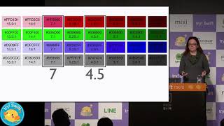
Shows that converting colors into a perceived-luminance space (OKLCH) fixes contrast mismatches across hues. Uses Evil Martians’ generator to build coherent color scales, checks them against WCAG, and reports reproducible contrast numbers (e.g., 5.9 for 800/200 and 2.9 for 500/100) yielding a readable palette that scales from yellow→green→blue without per-pair manual adjustments.
AI-written summary · about
chapters (7)
- 0:00Color accessibility intro
- 1:52Color contrast and perception
- 4:22HSL lightness limits
- 7:13Perceived lightness in LCH
- 10:04OKLCH solution
- 12:55OKLCH accessibility check
- 14:19Conclusion
related talks
 26mThe World Isn't Black and White, It's RGB
 49mInclusive Color: from Photons and Physiology to Psychology and Philosophy
 43mColor in CSS Or How I Learned to Disrespect Tennis
 16mColor Contrast for Accessibility
 06mDesign Accessibly: Color Contrast Tips and Tools
 44mError 404: Color Not found
 28mAccessible by Law! Generating Colors with JS and CSS Custom Properties
 46mResponsive Color