Accessibility in the Age of Components

summary
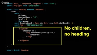
Component work focuses on concrete fixes: making button icons distinguishable by adding a box-shadow focus state, restricting SVG fills to a vetted palette via prop-types enforced color palette so contrast and titles are guaranteed, requiring inputs to include id+label and removing a standalone label export, and implementing aria-expanded/aria-haspopup plus arrow‑key handling for dropdowns. The library covers about 54 components, some fixes are two lines of CSS, dropdowns need substantial JS, and the changes propagate across Optimizely once merged.
AI-written summary · about
chapters (17)
- 0:00Introduction
- 1:00About me
- 1:33What does my job entail
- 3:10Agenda
- 3:48What is accessibility
- 4:18Benefits of component libraries
- 4:40Make a change
- 4:56The power of components
- 5:31Visual Accessibility
- 5:53Button Icons
- 7:51Contrast
- 10:30Titles
- 13:16Input
- 15:27Keyboard Navigation
- 15:43Dropdowns
- 17:32Pseudocode
- 18:50Takeaways
related talks
 30mScaling Accessibility in the Age of Components
 35mAccelerating accessibility in web
 40mAccessibility-flavored React components make your design system delicious
 50mAccessibility-flavored React components...
 24mRecipe for an Accessible Component
 10mCrafting Accessible Components for Component Libraries
 28mBuilding Accessible React Components
 23mBuilding Accessible Components: Best Practices and Business Buy-In