The visible invisibility of words
summary
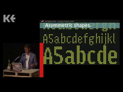
Design claim: a custom Parisine typeface solves RATP signage constraints by switching to caps-and-lowercase, narrow widths and then testing on LED bus legibility tests; workflow moves from outlines in FontLab to bitmap proofs and on-street trials where users prefer centered layouts but fail technical reading tasks. Deliverables include bespoke superfamilies for Le Monde, BCG, Nespresso and Galeries Lafayette, a Baskerville revival and a campaign serif whose ligatures at the Élysée actually go into production.
AI-written summary · about
chapters (6)
- 0:00Start
- 0:52The visible invisibility of words
- 6:24Parisine Started in 1996, this typeface now belong to the heritage of France.
- 30:013 typefaces families based on Baskerville for The Boston Consulting Group.
- 40:34FLAGSHIP STORE CHAMPS
- 41:47GALERIES LAFAYETTE The Parisian department store. September 2015.