Breaking Out of Media Queries

summary
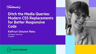
Argues that responsive layouts work without heavy media-query churn by using relative units and CSS math to keep designs fluid and bounded. Shows a banner that holds a fixed 40px side margin while scaling, a 7-column system using 100%/7 units so columns keep proportional widths, and font sizing using calc/min/max/clamp like clamp(1.5rem, 2.5vw, 4rem) to stop growth. Recommends picture/source for responsive images and the Cloudinary breakpoint generator to auto-create sizes.
AI-written summary · about
chapters (8)
- 0:00Introduction to media queries
- 1:55Using relative units in CSS
- 2:38Exploring calc function
- 4:46Min and max functions
- 7:12Clamping values with clamp
- 9:19Advantages over media queries
- 10:02Responsive images with HTML
- 11:52Summary and key takeaways
related talks
 35mModern CSS Replacements for Better Responsive Code
 43mMediaqueryless Responsiveness
 45mHow Responsive Are You in CSS? 2026 Edition
 29mBuilding responsive CSS components
 23mThe End of Media Queries
 35mScaling CSS Layout Beyond Pixels
 40mFuture-Proofing Responsive Web Design in 2023
 15mResponsive Design vs. Adaptive Design